Category Archives: modern calligraphy

Thoughts on Tuesday….

Dear Email Subscriber,
Do you really want this tosh from Ms Scarlet Blue landing in your inbox once a month? You are probably interested in calligraphy and are very disappointed when your monthly email arrives and it contains nothing but photos of Devon countryside, peculiar collages, and random words. I apologise.

I do indeed apologise. I have just this moment stumbled across my ‘Email stats’ – I didn’t know such stats existed. Apparently every time I publish a post it is immediately emailed to 101 recipients. 99% of the recipients open the email, but only 3% click through to this blog. My maths is appalling, but this might mean that 96% really aren’t very interested in my witterings. I am disturbing approximately 97 people unnecessarily!! If you are one of the 97 people then please unsubscribe! You know you want to and I will not be hurt by this seemingly callous action!

I am a little bit worried about the 3 people who don’t open the email at all. It is possible that they delete the email immediately, or they might be dead – it happens to us all, and I doubt we get to sort out our blog subscriptions before it does happen. All the junk we leave behind – real and virtual – it all needs sorting. The servers that hold the virtual junk use a lot of energy – I am just saying.

At this juncture I feel like I should add some calligraphy porn for those who subscribe to see some fancy writing. I have this, it is made from scraps of calligraphy, and I didn’t give much thought to the words I included. I made it back in May and haven’t looked at it since until today – and now it appears to have a theme! Weird.

Collage-of-calligraphy-scraps

Looking for direction?

To summarise: Please unsubscribe to stop receiving this tosh!!! Don’t unsubscribe if you like receiving this tosh!!! End of Broadcast.

News from the Mantelpiece….

Yes, a new post! How scary is that? What am I thinking? Surely my readers have a month to wait before I pop up again in their blog readers? Blame Jon. And Dinah. More on that later.

Meanwhile, I have news from the mantelpiece [the chair is having a much needed rest, probably sitting somewhere], and it looks something like this:-

my-studio-mantlepiece-2019

Mantelpiece

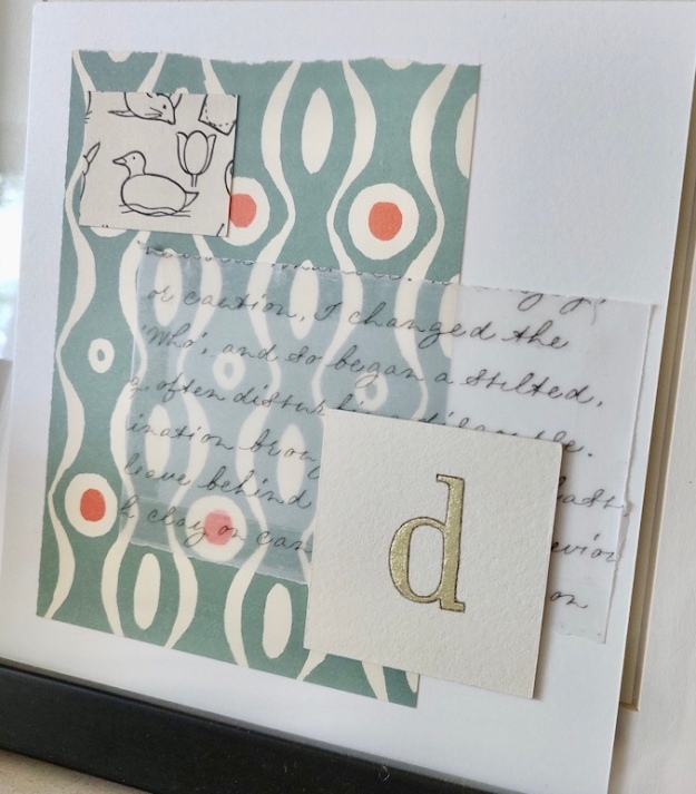
Oh wait, what is that interesting, yet sophisticated, picture? Oh my goodness! It’s another collage! Let’s take a closer look….

close-up of items-on-mantelpiece-in-calligraphy-studio-uk

Looking closer…

…and look! There is a gilded ‘d’!!

close-up-of-collage-with-gilded-letter-and-modern-script-calligraphy-uk

Shiny d!!

No? Then can I interest you in an orchid? I have kept it alive since March. Remarkable.

Orchid-on-mantlepiece

Still alive!

Well that was exciting wasn’t it?

Anyhow, Jon and Dinah have been talking about blogging and have been saying that only a few of us, in our little niche, post regularly, ie. more than twice a month, so I thought I would try to post more frequently. I know, I have said this before, but I am feeling in the mood to connect more often, AND I’m a collage behind, meaning I have pictures that I haven’t yet posted. I even have a post that I haven’t posted that isn’t related to the aforementioned pictures. So expect more. Especially on Sunday. There may be a coup.

Valentine Calligraphy Poem…

Calligraphy Poem

And now for something completely different, yet slightly similar… a poem.. written out in a modern calligraphy cursive. Yes, I might have changed the words of a more familiar Sonnet…

poem-on-aged-paper-written-in-a-modern-calligraphy-cursive-script-uk

My poem…

close-up-of-modern-calligraphy-cursive-script-uk

Close up!

Apologies for the lateness of my Valentine’s greetings. I did try to post it yesterday, but the Gods of technology seemed to be against me. I am having a lot of problems with this website, it’s not as easy to maintain as my Wonky Words site, so if you want to check to see if any Loopy Letters have been written then it’s best to check there first. This poem will be winging its way to a Loopy Letters recipient.

Talking of technology – and this is way off my remit – I have a fix for an Instagram issue, but I’ve not been sure where to post it. As many calligraphers do use Instagram I thought perhaps it would be relevant to post it here.

Ipad Fix for a Blurry Instagram Feed

Earlier in the year I was having problems viewing my Instagram feed on my vintage mini iPad; my whole feed was blurry and fuzzy making my Instagram experience unpleasant. I have discovered that this was caused by user error! Yes, I was inadvertently causing the problem! I tend to hold my iPad in landscape mode and thus click on my Instagram app from this position, this is the wrong thing to do! Why? Because the Instagram app is designed for phones not iPads, hence the app seems to be programmed to open properly from the portrait/vertical position. Opening the Instagram app from the vertical position makes my feed crystal clear. Such a simple fix. Before trying this fix close the Instagram app down completely from the home screen by double clicking on the home button and swiping up, then go back into Instagram holding the iPad vertically.

I really hope this fix helps someone!! The blurry, fuzzy feed was driving me nuts, it’s incredibly frustrating.

Anyhow, this is not a technology blog… and I promise that my next post will be all about calligraphy!!

A Letter of Complaint – Loopy Letter no. 1

Istared at the flickering cursor on the screen, and wondered how to explain my first Loopy Letter to my legion of fans. Perhaps I should remain mute and allow the letters to speak for themselves, as letters and words so often do. I doubted that further advice from me would be of assistance, and what was the big deal about having to explain everything anyway? I have always liked nonsense.

I could perhaps include a few photographs, a glimpse of my scribblings….

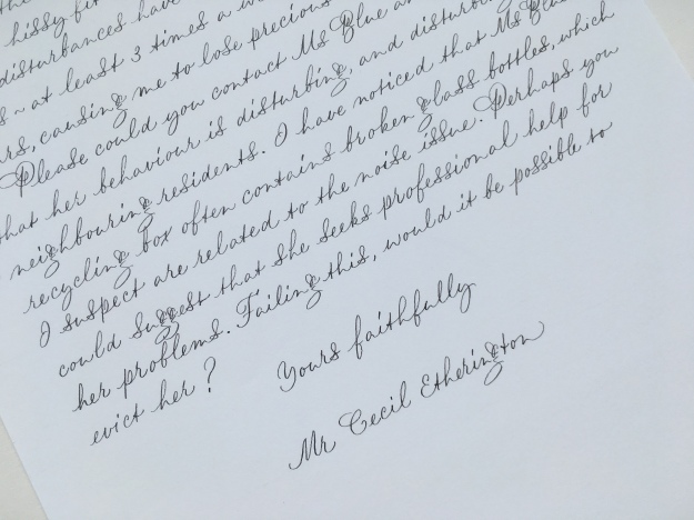
calligraphy-cursive-loopy-letter-1-UK

A letter of complaint….

…and perhaps I could tell my faithful readers that the letters are related to the now infamous ramblings about bottles on the Wonky Words blog. I chewed my lip as I thought about this confession. Some readers would turn away from this post in despair wishing that I would just let it go; they were perplexed enough by the posts about bottles of greed, and other deadly sins, how could they possibly cope with 100 letters in a similar vein?

I sighed. It was Tuesday afternoon and I really should have published something by now. The first Loopy Letter was complete with its own envelope; I had taken my reader over a decade back in time to 2006, to when the first bottle came into existence. It had been a turbulent time for all those around me, for my friends, relations, and especially my neighbours. I had been renting a tiny mid-terrace cottage in Mogwash, no. 2 Owl View….

casual-modern-calligraphy-used-for-a-letter-of-complaint

A letter of complaint….

Coming Next Week….

Loopy Letter no.2 – Who is Taramind Dewhurst??? Also, the possibility of copperplate in colour. Perhaps there will be gold, and maybe I will sign off with a flirtatious flourish. Or maybe the letter will be black and white and read all over. Groan.

Calligraphy for Halloween

This calligraphy site is still under construction, but that doesn’t mean that I can’t start adding my latest projects to my new blog!

Scribbly Calligraphy

For Halloween I signed up for an exchange with some UK calligraphy friends from Instagram. I wanted to attempt a new style of modern calligraphy… the scribbly unreadable variety where the lettering goes a bit wild and overlaps. This was tricky for me as I’m usually a stickler for making my writing legible – I will sometimes trash an envelope if there is an unsightly letter clash so making deliberate clashes made me wince. I used white Ecoline ink as it is less opaque than my preferred Dr Martin’s Bleed Proof White, and it achieved a ghostly effect I was after. My nib of choice was a Brause 66EF and this is how it turned out…

scribbly-modern-calligraphy-for-halloween

Suitably creepy…

I wasn’t happy writing it, but I was reasonably pleased with the result and I now feel encouraged to use this style on a larger piece, possibly using a variety of colours. The text I’ve used here is a short black magic spell that I found on the Internet – I think the scribbly treatment worked well with it, although I decided against using it for the envelope… I don’t believe in being mean to Postmen or Postwomen, so I wrote my usual copperplate script for these…

white-copperplate-lettering-on-black-envelopes-for-halloween-uk

Addressed-envelopes-exchange-with-fellow-calligraphers-for-halloween-2017-uk

Christmas is Coming!

My next project will probably be Christmas related, if I don’t start addressing my envelopes soon it’ll be the week before Christmas and I’ll be sitting at my desk dashing off addresses with a Bic Biro – and that simply won’t do! I intend to dig out the gold ink and make merry with the red envelopes! Although I suppose I ought to get on and finish this website…. I have a page about gilding to build…and there might be a flash of gothic and a wink of foundational…