Tag Archives: copperplate calligraphy

All Quiet…..

Sshhhhhh….. all the bloggers are sleeping, except for dear Jon – who is entertaining me with Blue Peter presenters and Postmodern Jukebox vibes, and lovely Mr Swings – who likes to share his dinners. It is quiet out there.

And what do I have to offer? Insightful views on Brexit? Non. My opinion on bralets? Oui, trés bon. Gilding antics? Yes!

gold-lettered-love-gilding-on-its-way-to-savannah-uk

Finally…something on its way to Savannah.

Tiny bears? Yes, I have tiny bears!!

framed-gilded-letter-g-with-genuine-gold-leaf-on-calligraphy-uk

Here’s one I made earlier….

And, I have a big blue autumnal sky over Devon….

Devon-sky-2018

Big sky….

I will finish with a random comment left on a vintage Scarlet Blue post back in 2011.

So glad the knickers will be clean.
I remember being quite taken by the Borg, especially at Wimbledon in the late 70s.

Loopy Letters – The Journey Continues….

“What have you done to the Loopy Letters website?” Screamed Charmaine via a text message.
I sighed, and tossed my iPhone into a nearby plant pot.
“Too much faff”, I muttered to myself.
It was okay for Charmaine and her modern ways, she was, at this very moment, sunning herself in the South of France and languishing in luxury on the proceeds of her inky misdeeds. I knew this because she had plastered the evidence all over her Instagram account. I, on the other hand, was staring through a grubby window at the relentless Devon murk and was questioning my commitment to the Loopy Letter project.

Question 1

How many letters have I actually written since November?

a) 20
b) None
c) 100
d) 1000
e) French

Question 2

Why have I written so much?

a) Calligraphy is my lifeblood; I live to sling ink, it is all that I know, without calligraphy I would be a withered husk of a person. Calligraphy is the only thing keeping me alive; every morning I skip to my studio as though I am skipping through a dewy meadow strewn with daisies and buttercups with nothing else on my mind other than letter formation and the universal line of beauty; life would be meaningless without letters…blah, blah, blah, etc, etc….

b) I had nothing else to do.

Question 3

More pertinently, why have I written so little??????

a) Sigh. Do I really have to answer this?
b) It was Winter.
c) Christmas happened.
d) My boiler broke down.
e) It was very cold and my hand fell off.

Question 4

Do I still intend to complete the Loopy Letter Project?

a) Yes!!! Yay!!! Can’t wait to get on with it!!! My nibs are poised and ready to blast off!!! Go me!! #girlboss.
b) Yeah, go on then.
c) Yes. I have closed down the Loopy Letters website and moved it to Wonky Words so that I am more accountable regarding moving the project along.

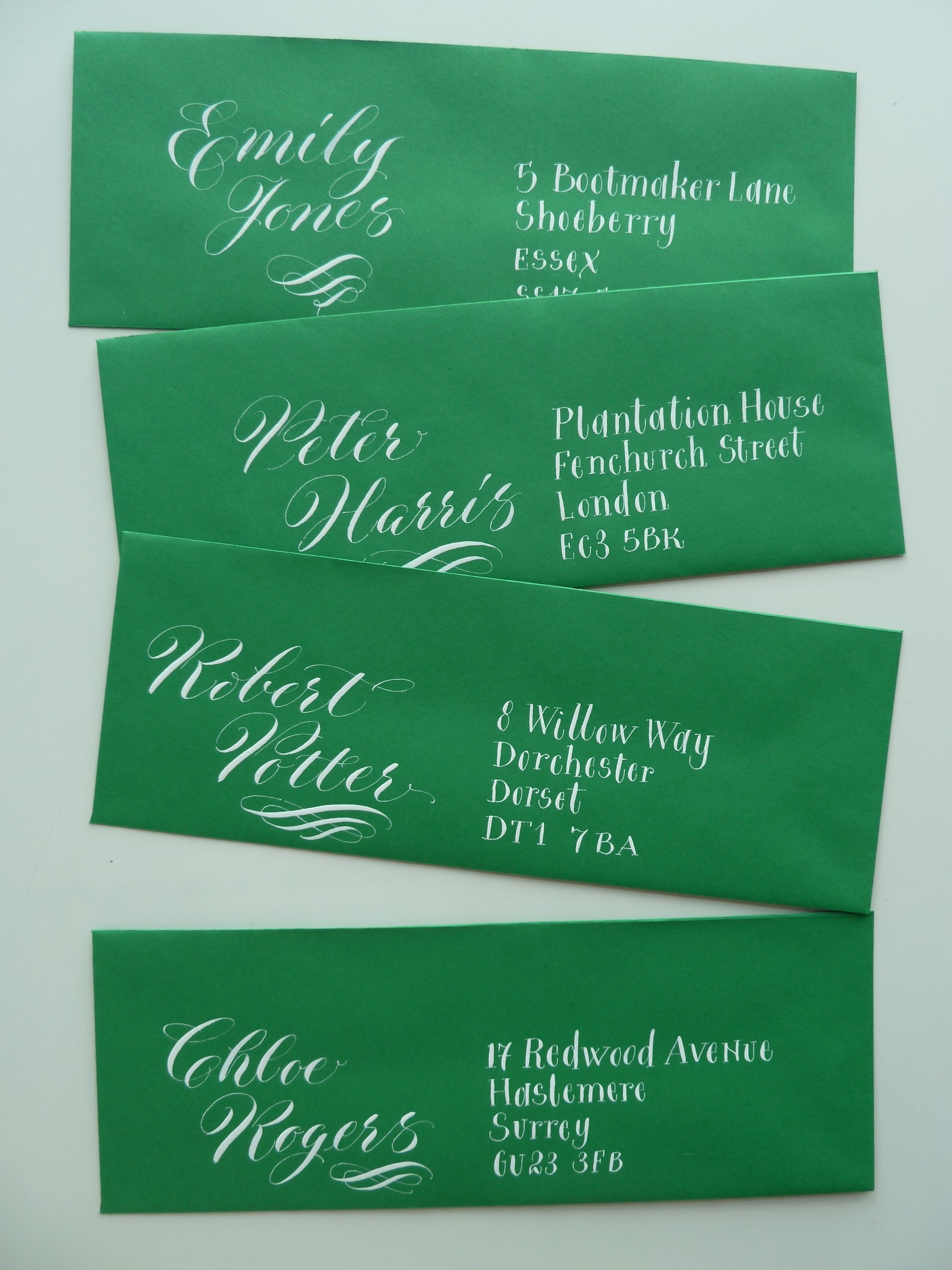
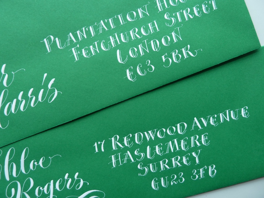
After questioning my commitment to the Loopy Letters project I decided that I would write a blog post to let those who were waiting expectantly by their letter boxes know exactly what was going on. It was only fair. I also decided to post some pictures of one of my failures… just so they’d know I’d been trying….

copperplate-calligraphy-on-crown-mill-paper-letter-writing-project-uk

Well, that doesn’t look so bad….

calligraphy-spelling-mistake-in-copperplate-calligraphy-devon-uk

Ah…. didn’t see that coming…

Right, I’m off now to skip through the daisies….

More Calligraphy Envelopes…..

As I said in my last post I got very bored during the Winter storms… so, yes, unfortunately I have MORE envelopes to slap on my blog… actually, I might have enough to blog about until 2016… JOKE!!! It’s just that when I moved I discovered that I had accumulated an awful lot of stationery, so I thought I’d use some of it up. I will try to do something different for my next post.

contrasting-calligraphy-styles-black-ink-on-white-envelopes

Looks corporate?

I have used this mix of calligraphy styles a few times, casual copperplate and roman written with a split nib, but this is the first time I’ve used it with black ink on white paper… which, I think, gives it a sort of corporate formal feel. I usually write these styles in cream on red, and it doesn’t look formal at all! I am a bit of a split nib fan, though they don’t seem to be as popular as they did when I got my first one… which was an Osmiroid [makes a mental note to write a post about my first calligraphy pens]. I like the contrast of these two styles – something flouncy with something simple.

two-calligraphy-styles-onaddressed-envelope-black-on-white

Close up!

It’s funny, but when I wrote these envelopes I started to feel homesick for the south east… odd.
Anyhow, moving on through the never ending pile of envelopes…

white-copperplate-calligraphy-on-green-envelopes

Green envelopes.

I found these skinny green envelopes and I was going to write the address horizontally in one long line beneath the name… but I changed my mind… I will save that for another time… I instead chose to use contrasting calligraphy styles – casual copperplate, and a wonky version of lower case letters written with a pointed nib. I was relatively happy with the result, but wanted to jazz up the address… and so I did this…

white-pointed-pen-capitals-on-green-envelope

Only slightly different.

This gives the appearance of the split nib, but it is far less formal and it is written with a Gillott 303 – I just added some extra fine lines as I went along.
So that’s me done for this week! Next week I will try to remember to slap up a post about my early calligraphy pens… and, I do actually still have my very first calligraphy practice pad… and I might share some pictures from it!!!

Toodlepip!

quirky-lettering-place-name

Casual pointed pen work

Quirky Calligraphy and something sensible….

More quirky calligraphy envelopes!! Well, I got a bit bored – what with all the rain and everything, what is girl to do other than huddle in her dining room and practice her calligraphy betwixt taking mouthfuls of cake????

white-quirky-calligraphy-on-black-envelopes-uk

Posy Flowers – Again!


white-quirky-calligraphy-on-black-envelope-uk

Simon Sweet!

I like writing this type of calligraphy as it’s quick, effective and creates an instant impact on coloured envelopes…. BUT… although this blog is called Wonky Words, I also write sensible words too… in normal copperplate. Every week I make time to practice my copperplate properly… correct spacing, correct letter angles [yes I rule up my paper properly too] and I refer to my copperplate books – I originally learnt from Mastering Copperplate Calligraphy by Eleanor Winters, this I think, gave me a good grounding for move lively pointed pen work.

white-copperplate-calligraphy-on-grey-envelope-uk

The Elegant Elsie Mophead…


white-copperplate-calligraphy-on-gray-envelope-uk

Simon Sweet…

I am a little bit besotted by my capital ‘K’ on this envelope and have tried to replicate it since… just can’t get it exactly the same… damn it!
Anyhow… ’til next week…

Toodlepip,

Sx