Tag Archives: modern quirky calligraphy uk

gold-italic-scroll-nib-calligraphy

Manual Posting….

I am shattered. Since the strange disappearance of Harold and Charmaine my workload has increased exponentially… quite frankly I didn’t know that colouring-in could be quite so tiring. Plus, I have been overwhelmed by the desire to send ALL my blog posts manually. Who knows why???

Anyhow, here is some evidence of my industry…

modern-calligraphy-italic-calligraphy-uk

handwritten-calligraphy-letter-and-italic-letter-to-friend

gold-calligraphy-quotation-uk

Anyhow, must fly, the post office is calling…

calligraphy-signature-uk

….oh…. and don’t I have to do something with ten rolls of tin foil????

Calligraphy idea….

This is more of a picture post to help me with my failing short term memory! But I have had an idea…. brought on by reading about what other people think about calligraphy. I will only explain my idea when I’ve actually done it… so the following photo is kind of like a sketchbook note to remind me to do something about the idea…

calligraphy-painting-of-pointed-pen-calligraphy-uk

The first cut is the deepest….

And on a different note, I have been looking at examples of Gothic calligraphy that is appearing all over the internet and I’ve noted that generally men seem to favour gothic calligraphy and women seem to like modern quirky lettering or copperplate… there are some wonderful female letterers who do superb Gothic, but it seems to be a very blokey thing… possibly because the overall effect of it has an aggressive punch. I like the work of Luca Barcellona and Niels Shoe Meulman – they are hugely influential at the moment. I am probably more drawn to the work I’ve seen from Niels Shoe Meulman… probably because he is is a bit more splashy and wild.
Anyhow, I have just found some of my Gothic calligraphy, written just before December 2013… because all the blokes were swearing and cursing in Fraktur I thought I’d redress the balance and write some words considered to be stereotypically female 🙂

gothic-practice-lettering-word-uk

Time of the month….?

It’s not brilliant! But it’s an idea to play with… I think I might have a go with a flat brush, as this might give me more of the effect I’m looking for. Plus I must get rid of my natural tendency to slant forward! This could also be a meme… I would be delighted if all the women out there reading this picked up their broad edged pens and began writing really nice words in Fraktur… think pastel colours, gentle words etc… go on, you know you want to…

More Calligraphy Envelopes…..

As I said in my last post I got very bored during the Winter storms… so, yes, unfortunately I have MORE envelopes to slap on my blog… actually, I might have enough to blog about until 2016… JOKE!!! It’s just that when I moved I discovered that I had accumulated an awful lot of stationery, so I thought I’d use some of it up. I will try to do something different for my next post.

contrasting-calligraphy-styles-black-ink-on-white-envelopes

Looks corporate?

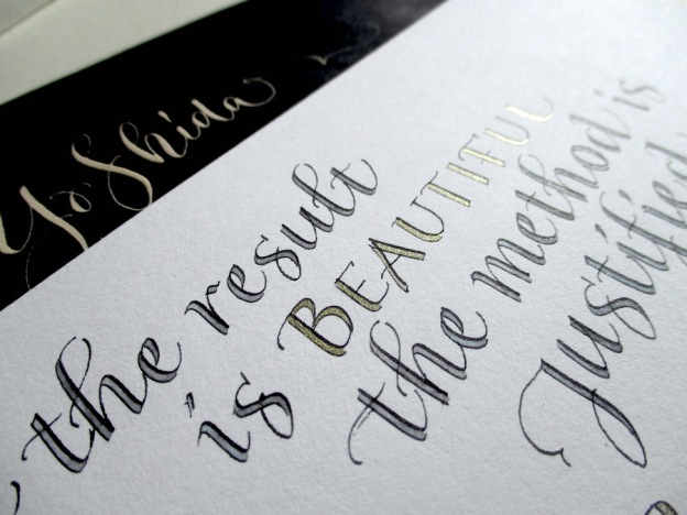
I have used this mix of calligraphy styles a few times, casual copperplate and roman written with a split nib, but this is the first time I’ve used it with black ink on white paper… which, I think, gives it a sort of corporate formal feel. I usually write these styles in cream on red, and it doesn’t look formal at all! I am a bit of a split nib fan, though they don’t seem to be as popular as they did when I got my first one… which was an Osmiroid [makes a mental note to write a post about my first calligraphy pens]. I like the contrast of these two styles – something flouncy with something simple.

two-calligraphy-styles-onaddressed-envelope-black-on-white

Close up!

It’s funny, but when I wrote these envelopes I started to feel homesick for the south east… odd.
Anyhow, moving on through the never ending pile of envelopes…
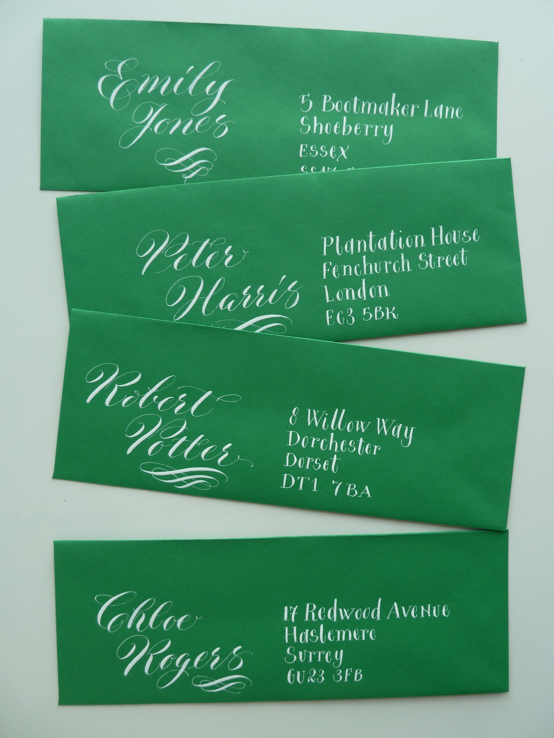
white-copperplate-calligraphy-on-green-envelopes

Green envelopes.

I found these skinny green envelopes and I was going to write the address horizontally in one long line beneath the name… but I changed my mind… I will save that for another time… I instead chose to use contrasting calligraphy styles – casual copperplate, and a wonky version of lower case letters written with a pointed nib. I was relatively happy with the result, but wanted to jazz up the address… and so I did this…

white-pointed-pen-capitals-on-green-envelope

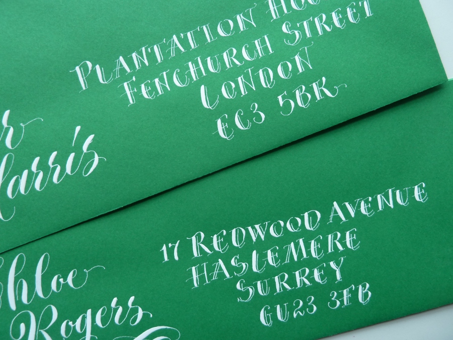
Only slightly different.

This gives the appearance of the split nib, but it is far less formal and it is written with a Gillott 303 – I just added some extra fine lines as I went along.
So that’s me done for this week! Next week I will try to remember to slap up a post about my early calligraphy pens… and, I do actually still have my very first calligraphy practice pad… and I might share some pictures from it!!!

Toodlepip!

quirky-lettering-place-name

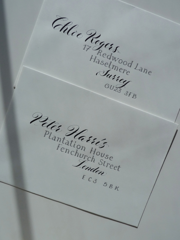
Casual pointed pen work