Tag Archives: quirky calligraphy uk

Calligraphy and Poems

A couple of weeks back I slapped up a few pictures of a poem into a blog post without much of an explanation… this was gratuitous calligraphy exposure… akin to unnecessary nudity in films. I apologise. I am referring to my rendering of Sweet Neglect by Ben Jonson. It is time to right that wrong… put some clothes on it so to speak.
Whenever I write a poem out in calligraphy I probably write it out in rough about four or five times to get a sense of what the poem is about. Sometimes I write it out more than this depending on how stupid I am feeling.
I realised what Sweet Neglect was about half way through my third rough draft… Ben is a bloke waiting to go out somewhere special with his partner. She is late home from work and hasn’t got time to get ready properly. She is flustered… Ben looks at her, and instead of simply saying you look fine as you are, he instead puts pen to paper and writes her the poem Sweet Neglect… which more or less says the same thing, but with more words…
Anyhow… with this in my mind I decided on a fun approach when I came to writing it out… I used a modern calligraphy style, which I actually drew rather than wrote, which took far longer than just writing it… but it gave me more options when it came to colour/shading etc. I used gouache and gold powder.
Here are some pics of the poem in progress….

outline-of-poem-drawn-in-modern-calligraphy-style-uk

Still to be coloured in….

calligraphy-poem-work-in-progress-uk

Should I have left it like this?!

modern-style-calligraphy-poem-progress-uk

Adding colour…

calligraphy-poem-in-progress-uk

Colouring the lettering….

The finished version of this is in my gallery… HERE

This was an interesting experiment, I am sort of pleased with it. There is more about Ben Jonson HERE…. blimey… he used to write satirical comedies… I have only just looked this up. I am amused! Hopefully he would be happy with my interpretation!

Meanwhile… I have a few more experiments on the go… so better get on….

Toodlepip,

Sx

More Calligraphy Envelopes…..

As I said in my last post I got very bored during the Winter storms… so, yes, unfortunately I have MORE envelopes to slap on my blog… actually, I might have enough to blog about until 2016… JOKE!!! It’s just that when I moved I discovered that I had accumulated an awful lot of stationery, so I thought I’d use some of it up. I will try to do something different for my next post.

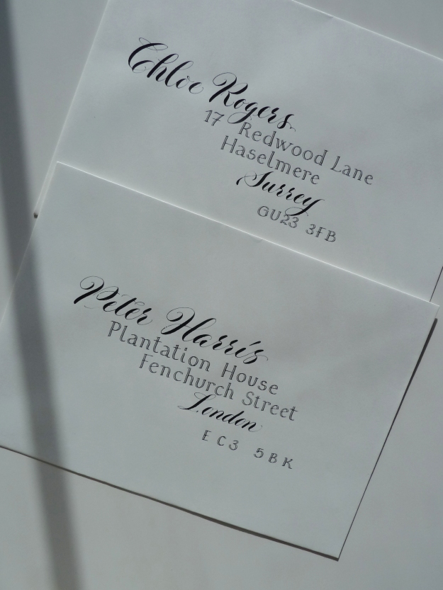
contrasting-calligraphy-styles-black-ink-on-white-envelopes

Looks corporate?

I have used this mix of calligraphy styles a few times, casual copperplate and roman written with a split nib, but this is the first time I’ve used it with black ink on white paper… which, I think, gives it a sort of corporate formal feel. I usually write these styles in cream on red, and it doesn’t look formal at all! I am a bit of a split nib fan, though they don’t seem to be as popular as they did when I got my first one… which was an Osmiroid [makes a mental note to write a post about my first calligraphy pens]. I like the contrast of these two styles – something flouncy with something simple.

two-calligraphy-styles-onaddressed-envelope-black-on-white

Close up!

It’s funny, but when I wrote these envelopes I started to feel homesick for the south east… odd.
Anyhow, moving on through the never ending pile of envelopes…

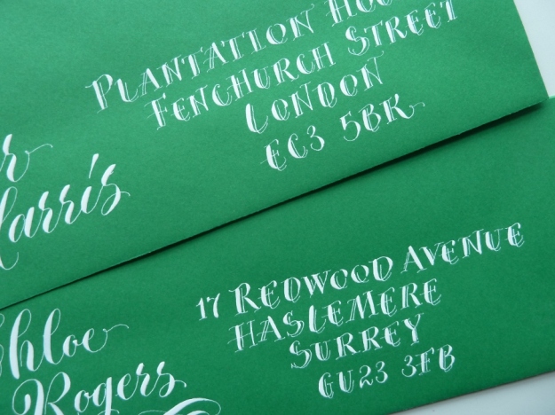
white-copperplate-calligraphy-on-green-envelopes

Green envelopes.

I found these skinny green envelopes and I was going to write the address horizontally in one long line beneath the name… but I changed my mind… I will save that for another time… I instead chose to use contrasting calligraphy styles – casual copperplate, and a wonky version of lower case letters written with a pointed nib. I was relatively happy with the result, but wanted to jazz up the address… and so I did this…

white-pointed-pen-capitals-on-green-envelope

Only slightly different.

This gives the appearance of the split nib, but it is far less formal and it is written with a Gillott 303 – I just added some extra fine lines as I went along.
So that’s me done for this week! Next week I will try to remember to slap up a post about my early calligraphy pens… and, I do actually still have my very first calligraphy practice pad… and I might share some pictures from it!!!

Toodlepip!

quirky-lettering-place-name

Casual pointed pen work

Quirky Calligraphy and something sensible….

More quirky calligraphy envelopes!! Well, I got a bit bored – what with all the rain and everything, what is girl to do other than huddle in her dining room and practice her calligraphy betwixt taking mouthfuls of cake????

white-quirky-calligraphy-on-black-envelopes-uk

Posy Flowers – Again!


white-quirky-calligraphy-on-black-envelope-uk

Simon Sweet!

I like writing this type of calligraphy as it’s quick, effective and creates an instant impact on coloured envelopes…. BUT… although this blog is called Wonky Words, I also write sensible words too… in normal copperplate. Every week I make time to practice my copperplate properly… correct spacing, correct letter angles [yes I rule up my paper properly too] and I refer to my copperplate books – I originally learnt from Mastering Copperplate Calligraphy by Eleanor Winters, this I think, gave me a good grounding for move lively pointed pen work.

white-copperplate-calligraphy-on-grey-envelope-uk

The Elegant Elsie Mophead…


white-copperplate-calligraphy-on-gray-envelope-uk

Simon Sweet…

I am a little bit besotted by my capital ‘K’ on this envelope and have tried to replicate it since… just can’t get it exactly the same… damn it!
Anyhow… ’til next week…

Toodlepip,

Sx

Scented Calligraphy!

My calligraphy has been used on a perfume label!!! See HERE! I am dead chuffed! I sold a few words to a designer last year, along with the copyright… I had no idea that my words had been any use to her until I saw this last night when I was perusing online. Well, I know what I want for Valentine’s Day! This has almost distracted me from the weather!!

Anyhow… I can’t write a post without including some of my dreadful photography… I have been seriously into writing envelopes lately… some of which will be sented (!) and others, such as these mock-ups, will be photographed badly and pasted onto this blog.

white-quirky-calligraphy-on-manilla-envelopes-devon-uk

Elsie Mophead???

calligraphy-envelope-address-uk

Thinking about cake. Again.

Yeah, you’re right, I should get my proper camera out and try harder with my photographic efforts. Sorry.
Meanwhile, I have been asked to supply some work for a Country Fair, which I believe is in May… so I should be slogging about doing that… some sort of photographic representation of this work will be here in about June… let’s hope these country events don’t get washed away and that lots of nice tourists come to Devon and Cornwall and that they buy stuff 🙂

Quick update… another pic…

white-quirky-lettering-on-manilla-envelopes-uk

A better effort???