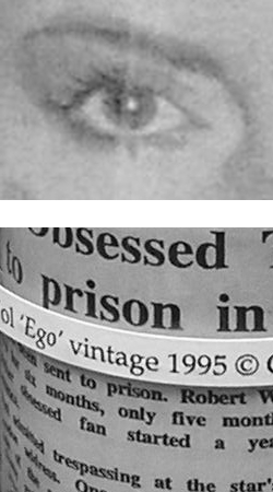
Where Did I Begin?

bottled-text-1995

Ego 1995

Sometimes it feels right to take a step back, to retreat to the place when it all began to unravel. Maybe I am incorrect. Maybe this was the place when it all began to knit together. I remember that it was quiet, that there were no distractions and nobody could see or hear me, so it didn’t matter what I said.

25th October 2006
Having found myself involved in a bizarre woodland adventure, I was once again inspired to follow my artistic dream. In a sunlit glade I found spelt out with broken twigs the word ‘Whatever’. Daringly, and with no heed to caution, I changed the twigs to spell ‘Who?’, and so began a stilted yet fascinating, often disturbing, discourse. With my imagination brought alive at last, I decided to leave behind for now, my previous dabblings with clay on canvas and take on a new direction – in some ways inspired by my woodland conversation, but touched with humour and irony…. and possibly using a more visual medium.
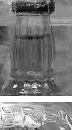
So began the bottling.
Initially my experiments with bottling were explosive, shards of flying glass would become precariously lodged in the kitchen ceiling. The process was long and extremely dangerous, there were times when I would hold my head in my hands believing the project to be doomed to failure. Then one day – EUREKA!, I discovered an ancient technique that made the process almost foolproof, I have only electrocuted myself three times since.
glass-bottle

During this period I was ably supported by close friends and family who visited me more often than usual. They too were fascinated by the process of bottling and were keen to keep me readily supplied with suitable clear glass bottles. For example, in the aftermath of my failed experiments, my close friend Jules was often at my side eager to empty bottles. Her encouragement, enthusiasm, dedication, and her nifty way with a Bar Craft Connoisseur cork screw cannot be too highly commended; her contribution to the project cannot be overemphasized, she is a legend in her own lifetime… albeit a tad incoherent…. and wobbly on her pins….

Not Calligraphy…

Sometimes calligraphy is not the answer to a lettering conundrum. Earlier in June I was contacted by designer Anita Bell to write several sentences on two 3 metre split and steam bent branches of Ash. The wood had been crafted by Ambrose Vevers, and was to be part of a larger sculpture, designed by Anita, that was to be installed in a contemporary office space in Shoreditch, London.
Anyhow, I met up with Anita and we concluded that my calligraphy might not be the answer… a cleaner, fresher, more contemporary lettering solution was needed…

Okay, there is no easy way to explain this other than:- Bodoni Font; tracing paper; 0000 paint brush; black acrylic paint, and 26 hours of painstaking very awkward painting…

split-branch-with-hand-painted-bodoni-font-lettering

After installation

hand-painted-lettering-on-steam-bent-split-ash-branches-devon-uk

Installed

close-up-of-hand-painted-lettering-on-steam-bent-split-branches-devon-uk

Close-up

hand-painted-lettering-on-bare-wood-devon-uk

Close-up

hand-painted-lettering-on-wooden-sculpture-devon-uk

Tricky to take a picture of…

hand-painted-lettering-on-wooden-sculpture-split-branches-uk

Still tricky to photograph…

I swear that this was one of the hardest projects I have ever worked on… working out if the sentences would fit… dealing with an uneven surface… fitting the branches into my studio without breaking a window… Although when I finished the pain was worth it, it was what Anita wanted, and for me, it was an achievement. Plus, this has given me a new, and healthy interest in well designed font lettering… there may be more of this sort of thing going on on this blog!

Wooden Words….

Remember way back when, when I said I was busy getting work ready for a craft show? Well that is all done now. The show is over. Anyhow, I have added a page to this blog showing all the work I contributed… apparently my work was a talking point, if nothing else!!

My new page is HERE – Wooden Words

calligraphy-on-wooden-sign-devon-uk

My favourite quotation….58cmx39cm

shabby-chic-paint-distressed-wooden-sign-with-calligraphy-inspired-lettering-devon-uk

says it all really….

I have thought about opening an Etsy store… I have thought about it long and hard. Seriously. And at length. I have decided that it is not for me, purely because I have realised that I am an incredibly fickle character… I enjoyed making these signs…. but I’m not sure that I would like to make too many of them on demand, but the odd commission is nice. I have always been fickle… on one hand it’s good because I don’t get stuck in a rut for very long… on the other hand… I never really settle to anything for longer than six months. It’s a character trait I have to bear in mind before committing to anything… it’s not a character trait that I seem to have any control over!!

So, now I have the wooden signs under my belt I am now moving on to my next ‘thing’ and my ongoing quest to find uses for calligraphy other than for wedding invitations etc continues….

Smoke me a kipper, I’ll be back for breakfast! [Ace Rimmer – Red Dwarf]

Calligraphy idea….

This is more of a picture post to help me with my failing short term memory! But I have had an idea…. brought on by reading about what other people think about calligraphy. I will only explain my idea when I’ve actually done it… so the following photo is kind of like a sketchbook note to remind me to do something about the idea…

calligraphy-painting-of-pointed-pen-calligraphy-uk

The first cut is the deepest….

And on a different note, I have been looking at examples of Gothic calligraphy that is appearing all over the internet and I’ve noted that generally men seem to favour gothic calligraphy and women seem to like modern quirky lettering or copperplate… there are some wonderful female letterers who do superb Gothic, but it seems to be a very blokey thing… possibly because the overall effect of it has an aggressive punch. I like the work of Luca Barcellona and Niels Shoe Meulman – they are hugely influential at the moment. I am probably more drawn to the work I’ve seen from Niels Shoe Meulman… probably because he is is a bit more splashy and wild.
Anyhow, I have just found some of my Gothic calligraphy, written just before December 2013… because all the blokes were swearing and cursing in Fraktur I thought I’d redress the balance and write some words considered to be stereotypically female :-)

gothic-practice-lettering-word-uk

Time of the month….?

It’s not brilliant! But it’s an idea to play with… I think I might have a go with a flat brush, as this might give me more of the effect I’m looking for. Plus I must get rid of my natural tendency to slant forward! This could also be a meme… I would be delighted if all the women out there reading this picked up their broad edged pens and began writing really nice words in Fraktur… think pastel colours, gentle words etc… go on, you know you want to…

Scribbly Calligraphy

I am no longer going to write posts. Have decided to slap up pics in an instant way deprived of any explanation. Nobody reads anymore anyhoo. I could write penis, penis, penis and nobody would be any the wiser so long as there is a picture to distract them.
Here is a crap picture of some italic variation wot I did at the weekend.

italic-variation-calligraphy-uk

Going…..

Tuddlepop,

Sx

Calligraphy and Poems

A couple of weeks back I slapped up a few pictures of a poem into a blog post without much of an explanation… this was gratuitous calligraphy exposure… akin to unnecessary nudity in films. I apologise. I am referring to my rendering of Sweet Neglect by Ben Jonson. It is time to right that wrong… put some clothes on it so to speak.
Whenever I write a poem out in calligraphy I probably write it out in rough about four or five times to get a sense of what the poem is about. Sometimes I write it out more than this depending on how stupid I am feeling.
I realised what Sweet Neglect was about half way through my third rough draft… Ben is a bloke waiting to go out somewhere special with his partner. She is late home from work and hasn’t got time to get ready properly. She is flustered… Ben looks at her, and instead of simply saying you look fine as you are, he instead puts pen to paper and writes her the poem Sweet Neglect… which more or less says the same thing, but with more words…
Anyhow… with this in my mind I decided on a fun approach when I came to writing it out… I used a modern calligraphy style, which I actually drew rather than wrote, which took far longer than just writing it… but it gave me more options when it came to colour/shading etc. I used gouache and gold powder.
Here are some pics of the poem in progress….

outline-of-poem-drawn-in-modern-calligraphy-style-uk

Still to be coloured in….

calligraphy-poem-work-in-progress-uk

Should I have left it like this?!

modern-style-calligraphy-poem-progress-uk

Adding colour…

calligraphy-poem-in-progress-uk

Colouring the lettering….

The finished version of this is in my gallery… HERE

This was an interesting experiment, I am sort of pleased with it. There is more about Ben Jonson HERE…. blimey… he used to write satirical comedies… I have only just looked this up. I am amused! Hopefully he would be happy with my interpretation!

Meanwhile… I have a few more experiments on the go… so better get on….

Toodlepip,

Sx