Tag Archives: modern calligraphy

modern-calligraphy-quotation-by-Scarlet-Blue-UK-pointed-pen-lettering-UK

Dear Scarlet….

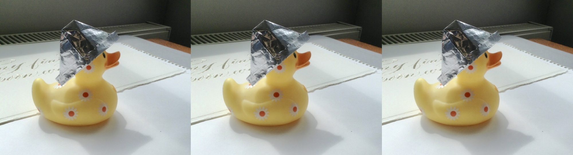
Way back in June 2011, Wendy, a regular commenter on my old Scarlet Blue blog, made the following request:-

Scarlet, could you start an agony aunt column? My friends have so many problems and I’m sure your insightful feedback would steer them in the right direction.

For example:-

I’ve got a friend in their late 50’s, very GEEKY with a real anorak, inability to button shirt in the right holes, cardigan, bum-fluff beard, bald, and knows more trivia on Dr Who than the whole Dr Who production team put together. Anyway, he’s in love with Mario (Big Brother contestant last year), and keeps on talking about it. Currently I smile and talk back as if Mario were a friend of my friend. I suspect my friend is internet stalking Mario without realising it.
what should I do? If anything.

Originally I felt overwhelmed by Wendy’s request…. who was I to deal with other people’s problems? Who am I to tell other people what to do with their lives? What do I know? And then I thought, what the hell, I’ll give it a whirl….

Dear Wendy,

Many apologies for such a tardy response. Please do not worry about your friend, he is simply ahead of his time! In 2015, it would be considered odd not to have a passing fancy for Dr Who. As for his dress sense and facial accumulation, well, again, truly ahead of his time, and it’s probable that he was one of the original Shoreditch Hipsters. If I were you I would buy a house next door to him [in Hipster areas house prices tend to go through the roof], and jot down any fashion tips that come your way. Does he now has his own lifestyle blog? Does he wax lyrical about whittling spoons beneath the stars in a Sussex woodland… and then sell them for £1,180 a pop from a stall in Old Spitalfields Market?
I’m sure that back in June 2011 your friend seemed a little incongruous, but in 2015 he fits right in!

Moving on to the Mario situation… Oh!! You mean Mario the Mole!!! Z list celebs such as Mario are created for our entertainment; I am sure they know exactly what they are getting themselves into when they sign up for the BB experience, namely financial reward and fleeting fame. After leaving the BB House they have a porthole of opportunity to cash in on their popularity before public interest wanes. Quite frankly, Mario should be grateful for your friend’s adoration.

I am assuming your friend is male? If your friend is female, and is unhappy, then perhaps a trip to her GP would be advisable? A female with a button disability is worrisome and beyond my remit, I can only suggest velcro.

Warmest Regards,

Scarlet xxx

If anyone would like to feature their problem on this blog then my email address can be found on my ‘About’ page. Thank you, I look forward to reading your dilemmas.

An Invitation of Sorts….

8th April 2015

Taramind Dewhurst, the immaculately groomed curator of The Onion Gallery, held the envelope in her grubby little hands. She had always had small hands, even as a child, they were delicate but had a firm grasp on her paperwork. She turned the envelope over and caressed her name and address, which felt raised, as if embossed.

copperplate-calligraphy-on-envelope-uk

A double constrictor knot…

Not printed then, she purred, knitting her brows into a double constrictor knot, which is unflattering on anyone of any age. Taramind was familiar with the craft of calligraphy and it was not a craft that she particularly cared for, she preferred the clean lines and balanced features of printed fonts, but she had to concede that this calligraphy had an awkward, yet modern charm. She hesitated before ripping the envelope open, as a lion would do before feasting on a caribou, and tried to guess the nature of the invitation, because surely this had to be an invitation?
She reached across her desk for her letter opener. Taking the antique bronze dagger from its sheath she made an opening incision, thus removing precisely 2mm from the top of the envelope. Within the envelope were two pieces of brown cardboard that were taped together to protect the inner content. With a concentration that caused her brows to knit once more, this time into a pair of socks, Taramind picked at the tape with her manicured nails. Two hours and one broken nail later, Taramind placed the contents on her blotter.
What sort of game is this? She wondered in italics. Why would anyone send her a photograph of a Pot Noodle? She turned the photograph over. There was a date, 21st November 2045, and an address for a village hall in a place called Mogwash….

modern-copperplate-calligraphy-address-uk

An invitation of sorts….

Calligraphy and Poems

A couple of weeks back I slapped up a few pictures of a poem into a blog post without much of an explanation… this was gratuitous calligraphy exposure… akin to unnecessary nudity in films. I apologise. I am referring to my rendering of Sweet Neglect by Ben Jonson. It is time to right that wrong… put some clothes on it so to speak.
Whenever I write a poem out in calligraphy I probably write it out in rough about four or five times to get a sense of what the poem is about. Sometimes I write it out more than this depending on how stupid I am feeling.
I realised what Sweet Neglect was about half way through my third rough draft… Ben is a bloke waiting to go out somewhere special with his partner. She is late home from work and hasn’t got time to get ready properly. She is flustered… Ben looks at her, and instead of simply saying you look fine as you are, he instead puts pen to paper and writes her the poem Sweet Neglect… which more or less says the same thing, but with more words…
Anyhow… with this in my mind I decided on a fun approach when I came to writing it out… I used a modern calligraphy style, which I actually drew rather than wrote, which took far longer than just writing it… but it gave me more options when it came to colour/shading etc. I used gouache and gold powder.
Here are some pics of the poem in progress….

outline-of-poem-drawn-in-modern-calligraphy-style-uk

Still to be coloured in….

calligraphy-poem-work-in-progress-uk

Should I have left it like this?!

modern-style-calligraphy-poem-progress-uk

Adding colour…

calligraphy-poem-in-progress-uk

Colouring the lettering….

The finished version of this is in my gallery… HERE

This was an interesting experiment, I am sort of pleased with it. There is more about Ben Jonson HERE…. blimey… he used to write satirical comedies… I have only just looked this up. I am amused! Hopefully he would be happy with my interpretation!

Meanwhile… I have a few more experiments on the go… so better get on….

Toodlepip,

Sx

Learning Calligraphy, quirky or otherwise….

These days I mostly get enquiries from people wanting to know how to learn calligraphy, my answer is to point them in the direction of CLAS, who provide a comprehensive list of accredited teachers. I also tell enquirers to visit Scribblers who advertise calligraphy courses in copperplate, roman capitals, italic etc. Janet Smith at Oakleaf Calligraphy also provides an online learning course. It is no good asking me to teach you… I am entirely self-taught, which means I have probably taught myself some appalling bad habits. I wish I had learnt properly from the outset, as it would probably have been quicker, and cheaper.
I learnt copperplate calligraphy from a book – Mastering Copperplate Calligraphy by Eleanor Winters and I taught myself quirky calligraphy from following the advice in Lisa Engelbrecht’s wonderful book – Modern Mark Making. I Recently purchased Modern Calligraphy by Molly Suber Thorpe – which is a superb book covering everything you need to know about writing quirky modern calligraphy… it  has a great projects section as well, which ranges from how to write on chalkboards to making water colour gift tags for weddings, parties and special occasions.

calligraphy-books-for-learning-and-inspiration-uk

Calligraphy books for learning…

I usually buy most of my supplies from Scribblers, I mostly use a Gillott 303 nib… but to start with I used a 404 because a 404 is less flexible and therefore easier to control. The nibs from Scribblers are HERE. When I started learning copperplate I did use an oblique pen holder, but I now only use straight pen holders… all pen holders are HERE. When starting out there’s no harm in trying a straight and an oblique just to see which you prefer, I like short pen holders like the school pen holder. I am cheap and cheerful :-) For general calligraphy and practice I use Higgins Eternal permanent black ink; for ‘best’ I use Schmincke calligraphy gouache.

Some would imagine that the calligrapher is neat, tidy and organised… I wish I was. My desk always looks like a bomb has hit it… don’t work like this, it is hellish and I never know what I’m doing….

calligraphy-studio

My new studio…

Meanwhile, my mantelpiece is tidy….

calligraphy-painting-on-mantelpiece

On my mantelpiece….

More Calligraphy Envelopes…..

As I said in my last post I got very bored during the Winter storms… so, yes, unfortunately I have MORE envelopes to slap on my blog… actually, I might have enough to blog about until 2016… JOKE!!! It’s just that when I moved I discovered that I had accumulated an awful lot of stationery, so I thought I’d use some of it up. I will try to do something different for my next post.

contrasting-calligraphy-styles-black-ink-on-white-envelopes

Looks corporate?

I have used this mix of calligraphy styles a few times, casual copperplate and roman written with a split nib, but this is the first time I’ve used it with black ink on white paper… which, I think, gives it a sort of corporate formal feel. I usually write these styles in cream on red, and it doesn’t look formal at all! I am a bit of a split nib fan, though they don’t seem to be as popular as they did when I got my first one… which was an Osmiroid [makes a mental note to write a post about my first calligraphy pens]. I like the contrast of these two styles – something flouncy with something simple.

two-calligraphy-styles-onaddressed-envelope-black-on-white

Close up!

It’s funny, but when I wrote these envelopes I started to feel homesick for the south east… odd.
Anyhow, moving on through the never ending pile of envelopes…

white-copperplate-calligraphy-on-green-envelopes

Green envelopes.

I found these skinny green envelopes and I was going to write the address horizontally in one long line beneath the name… but I changed my mind… I will save that for another time… I instead chose to use contrasting calligraphy styles – casual copperplate, and a wonky version of lower case letters written with a pointed nib. I was relatively happy with the result, but wanted to jazz up the address… and so I did this…

white-pointed-pen-capitals-on-green-envelope

Only slightly different.

This gives the appearance of the split nib, but it is far less formal and it is written with a Gillott 303 – I just added some extra fine lines as I went along.
So that’s me done for this week! Next week I will try to remember to slap up a post about my early calligraphy pens… and, I do actually still have my very first calligraphy practice pad… and I might share some pictures from it!!!

Toodlepip!

quirky-lettering-place-name

Casual pointed pen work