
As I said in my last post I got very bored during the Winter storms… so, yes, unfortunately I have MORE envelopes to slap on my blog… actually, I might have enough to blog about until 2016… JOKE!!! It’s just that when I moved I discovered that I had accumulated an awful lot of stationery, so I thought I’d use some of it up. I will try to do something different for my next post.

Looks corporate?
I have used this mix of calligraphy styles a few times, casual copperplate and roman written with a split nib, but this is the first time I’ve used it with black ink on white paper… which, I think, gives it a sort of corporate formal feel. I usually write these styles in cream on red, and it doesn’t look formal at all! I am a bit of a split nib fan, though they don’t seem to be as popular as they did when I got my first one… which was an Osmiroid [makes a mental note to write a post about my first calligraphy pens]. I like the contrast of these two styles – something flouncy with something simple.

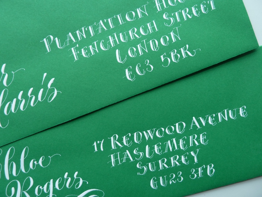
Close up!
It’s funny, but when I wrote these envelopes I started to feel homesick for the south east… odd.
Anyhow, moving on through the never ending pile of envelopes…
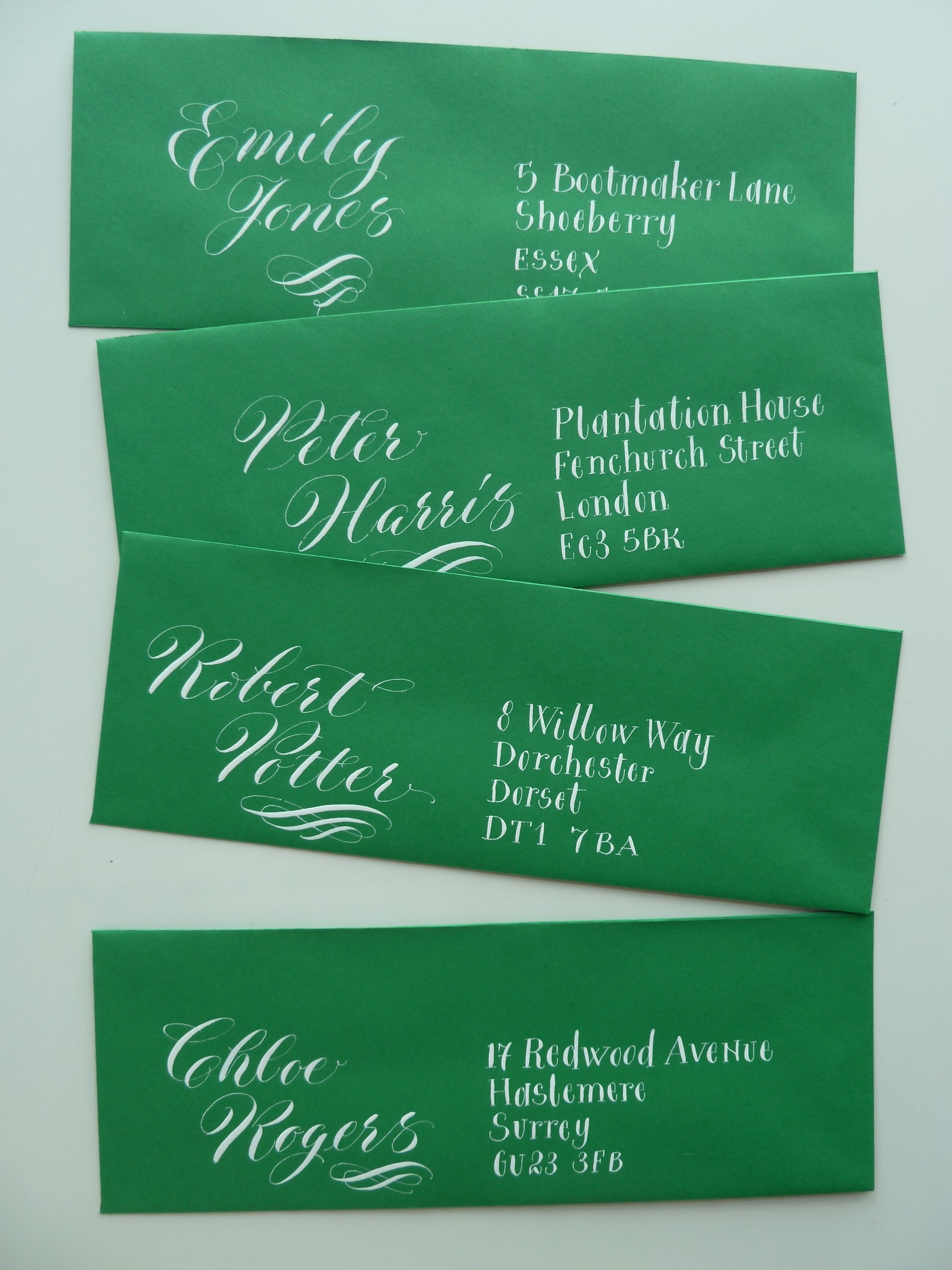
Green envelopes.
I found these skinny green envelopes and I was going to write the address horizontally in one long line beneath the name… but I changed my mind… I will save that for another time… I instead chose to use contrasting calligraphy styles – casual copperplate, and a wonky version of lower case letters written with a pointed nib. I was relatively happy with the result, but wanted to jazz up the address… and so I did this…
Only slightly different.
This gives the appearance of the split nib, but it is far less formal and it is written with a Gillott 303 – I just added some extra fine lines as I went along.
So that’s me done for this week! Next week I will try to remember to slap up a post about my early calligraphy pens… and, I do actually still have my very first calligraphy practice pad… and I might share some pictures from it!!!
Toodlepip!

Casual pointed pen work

I like the split nibby fonts.
I’m thinking the first ones would look more corporate with only the split nib font and left-justified. Sorry.
LikeLike
No worries Mr Lax! Let me look through my mountain of envelopes, I probably have some like that somewhere….
Sx
LikeLike
I’m with Lax. The split pen effect is very effective. I think I’m getting to know your personal style. Finally. I also like how the shadow spills over the first pic.
LikeLike
…yes, I have a penchant for envelopes! Agreed, each calligrapher has his or her personal style… like with ordinary handwriting… you just can’t disguise it, nor should you.
Sx
LikeLike
Lucky me! I have a skinny green envelope.:-) And I useed to have a split nib.More than one, in fact.I had some dip-nibs.And , coincidentally, I’ve just flushed dried ink(naughty me!) out of my Lamy. Perhaps I’ll write you a letter as a test…
LikeLike
Sorry, Dinah, I thought I replied here. Yes, you do have a skinny green envelope! I seem to have an endless supply!
Sx
LikeLike
When I saw “Chloe Rogers”, I thought it might be a business card detailing her talents and I wondered, “Is that all she does?”
LikeLike
Ha Ha! I did a LOL.
Sx
LikeLike
I never get enough of your beautiful calligraphy style, Scarlet. These envelopes are worth framing to decorate a big wall! I just love them! 😉
LikeLike
Good thing there were so many storms in Burdishland, sweetie. Now we can enjoy your calligraphic art. Keep showing it, it’s simply beautiful!
LikeLike
Hi Scarlet, fancy finding you here! I was surfing for Calligraphy blogs and when I saw you I thought I know that face from John G’s “Publog”. You can run, but you can’t hide!
I love your calligraphy. I used to do lettering and calligraphy, but mainly on glass when I used to make stained glass windows for churches and chapels etc. Now I’m retired I spend my time going to the “Hollybush” and annoying John, and making leather covered journals for other people to write in and spoil..
LikeLike
Beautiful!
LikeLike
Thank you!
Sx
LikeLike